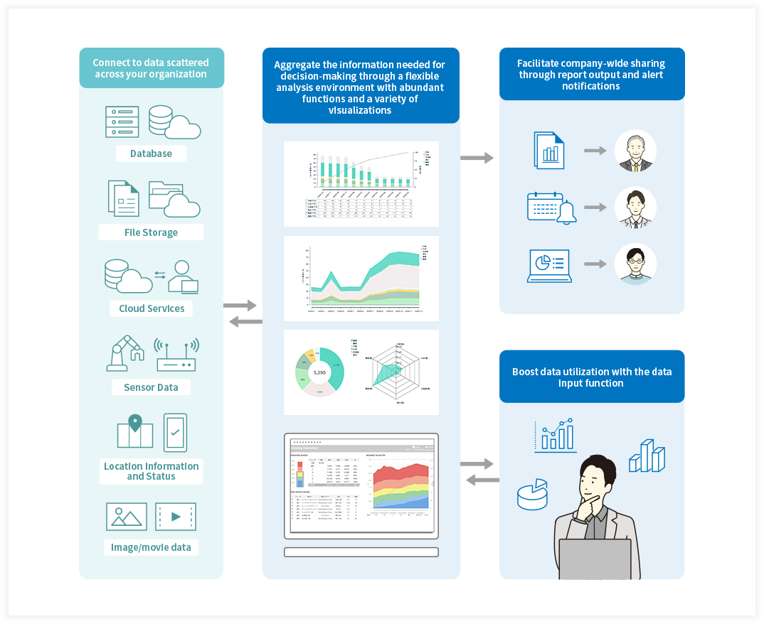
Aggregates and visualizes data to bring about action
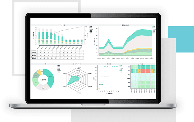
BI dashboard
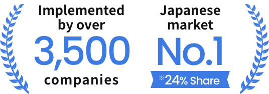

* First place in the data analysis and utilization support software/services category in the Nikkei Computer Customer Satisfaction Survey 2024-2025
* Total number of cloud and package versions (end of February 2025)
* Estimated by us based on the BI tool actual sales in 2023 in “Software Business New Markets in 2024” by Fuji Chimera Research Institute. Defined operational BI tools as BI tools that enable users to collect and analyze data and improve usefulness and productivity. Calculated the market share of the operational BI tool based on the total sales of packages and SaaS for the relevant group of companies.
Start utilizing data
with MotionBoard

PROBLEM
Are you struggling with
analyzing and utilizing data
in your business and operations?
-
 I want to increase the quality and speed of business operations and decision-making by aggregating and utilizing the needed data.
 -
 I want to build an environment for company-wide data utilization, not just for personal use by a few analysts.
 -
 I want to visualize and share data in an easily understandable format, like graphs, maps and alert notifications.
 -
 I am unsure how to utilize data and lack the relevant expertise and human resources in our organization.
MotionBoard helps you
make the most of your data
MotionBoard can be used
in the following scenarios
-
Management
Visualization of management indicators
KPI management and forecasts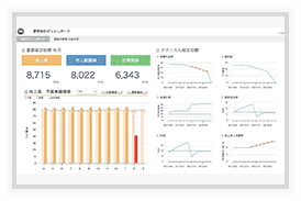
-
Marketing
Customer information analysis
Area marketing
-
Sales
Budget management and project management
Sales trends analysis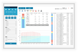
-
Manufacturing
Visualization of operating conditions
Inventory optimization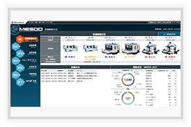
-
Human Resources
Visualization of productivity
Effective placement of personnel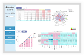


ABOUT
What is MotionBoard?
MotionBoard is a BI tool that provides
a single platform with all the functions
you need to utilize data.
With MotionBoard, anyone can easily
perform specialized aggregation and analysis work.
It also visualizes shared indicators throughout the organization
to bring about action.
REASON
Reasons behind
MotionBoard's popularity

A wide variety of visualizations
that cover industry-specific needs
Create presentations that support your business,
such as maps and calendars for the retail and distribution
industry, and control charts and Gantt charts for the manufacturing industry.


A rich set of
features that
boost data utilization
MotionBoard is an ideal platform for
promoting data utilization throughout companies,
with features such as data input and report output.

A support system
and in-house development
you can continue
to use confidently
MotionBoard comes with a full support system
that includes responsive and flexible support for inquiries,
as well as training videos, and manuals.


Provides expertise for
successful data utilization
You can get tips on using MotionBoard
in your operations,
including expertise provided by
industry-specific units
and information shared
in the user community.

MotionBoard's Cloud version allows you to start small
With the cloud version, you do not need to procure
a server and storage space is included by default.

TASK & IDEAL
Issues in data utilization
and the ideal conditions
you can achieve with MotionBoard
I cannot obtain the data needed
for decision-making right away
Creating reports is time-consuming
and I can't focus on analysis
I cannot view figures
in a multifaceted or intuitive way,
or dig deeper into details
-

Automate aggregation
and report creationReduce man-hours spent on
creating reports,
and focus on
more creative work -

Real-time notification
of the latest informationChanges can be informed by email
or by charts,
which can
lead to quick action -

Facilitate timely and
precise decision-makingDashboards visualize
the latest information
and support data-based decision-making
-

More information
